

The Nintendo Wii was a massive hit when it launched in 2006. The family-focused game system was one of the most successful consoles in Nintendo's history thanks to a bevy of reasons. But one of the things that really helped the Nintendo Wii become an instant triumph was the marketing behind it. The Wii branding was unique, but it turns out that that look could have been entirely different.
Nintendo seems to have gone through many different ideas with its home console as a follow-up the GameCube. The Nintendo Revolution was the initial name of the Nintendo Wii, and many of the early titles were leaning more towards a hardcore audience. Games such as The Legend of Zelda: Twilight Princess, Disaster: Day of Crisis, and Red Steel were titles that were shown off and geared towards an older audience. But with the announcement of the name change to the Nintendo Wii, the focus shifted towards games like Wii Sports. Even the "Wii would like to play" campaign was all about family fun.
RELATED: How 4K Support Would Change the Rumored Nintendo Switch Pro
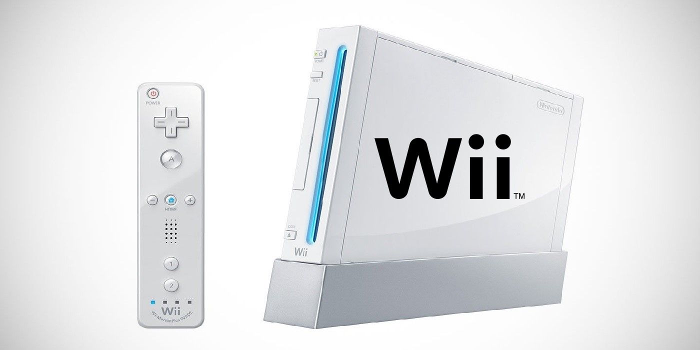
Nintendo moved towards a bubbly and fun name change, and the logo shifted along with it. But that now-iconic Wii logo seems to have taken over a hundred and fifty iterations. Recently, a 2007 Nintendo Company Handbook was uncovered, and with it came an image of dozens and dozens of different logo styles that The Big N had to choose from. In the end, only one Nintendo Wii logo was selected. With the over 100 million Nintendo Wiis sold around the world, it looks like the right one was chosen.
It is clear that Nintendo knew, generally speaking, what it was going for with the Wii logo. Over half of the proposed logos seem to be very close to the final product, with slight changes to the font, color, etc. What is intriguing is finding the few that really stick out. One almost looks like the Rogue Squadron patch from Star Wars. Another has two people holding hands as the letters i and i in the word Wii. A few of them barely look like they are spelling out the word Wii at all. When Reggie Fils-Aime joined Nintendo, he was adamant about keeping the Nintendo logo traditional. It shouldn't be a surprise that the Wii logo doesn't stray too far from simplicity.
Getting a behind the scenes look at the making of the Wii logo is special. Just last week, a video from 1990 of the Nintendo of America headquarters appeared online, and it again gave fans a peek at what is usually a very secretive company. Nintendo's approach has the business thinking outside of the box in terms of video game strategy. Whether it is the Nintendo Wii with motion controls, a dual-screen handheld in the Nintendo DS, or a hybrid console Nintendo Switch, fans seem to appreciate a company that does things a bit differently than the rest.
MORE: Nintendo's Shigeru Miyamoto Reveals His Leadership Style and Future Plans
