

The Pokemon series is home to some of the finest creature designs. If not for the great mix of creativity and simplicity, Pokemon would not nearly be as successful. The past 25 years have given some of the most iconic designs for video game characters, and Game Freak deserves credit for that.
RELATED: Pokémon GO: 10 Best Looking Shinies In The Game
However, when so many Pokemon are required to fill a Pokedex, there are going to be a few misses. Some designs are uninspired or lazy, and they seem to just fill space between the good designs. Despite what some fans may think, the worst designs aren't the weird ones. The worst designs are the ones that simply fill no purpose. They don't take any risks or creative spins. In some cases, they're outright just not appealing. This isn't something every person is going to agree on, but these designs are widely regarded as far from spectacular.
10 Voltorb
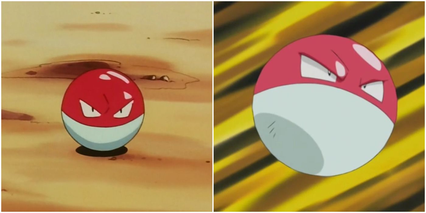
Kanto's designs are great, but there aren't too many standouts. The thing that works about Kanto's Dex is simplicity. Considering some of the beta designs, it's for the best they kept it simple with rats, birds, and the occasional oddity. Unfortunately, while most oddities are forgivable, Voltorb is just pure laziness.
Voltorb, in lore, is the result of a Poke Ball being hit with a strong electrical impulse. There are some theories that it's also the result of a paranormal incident. Either way, it's an orb with an angry face. There are so many other more interesting electric types, even the literal magnets. Electrode is also pretty bad, but it's smirk gives it a bit of charm.
9 Sigilyph
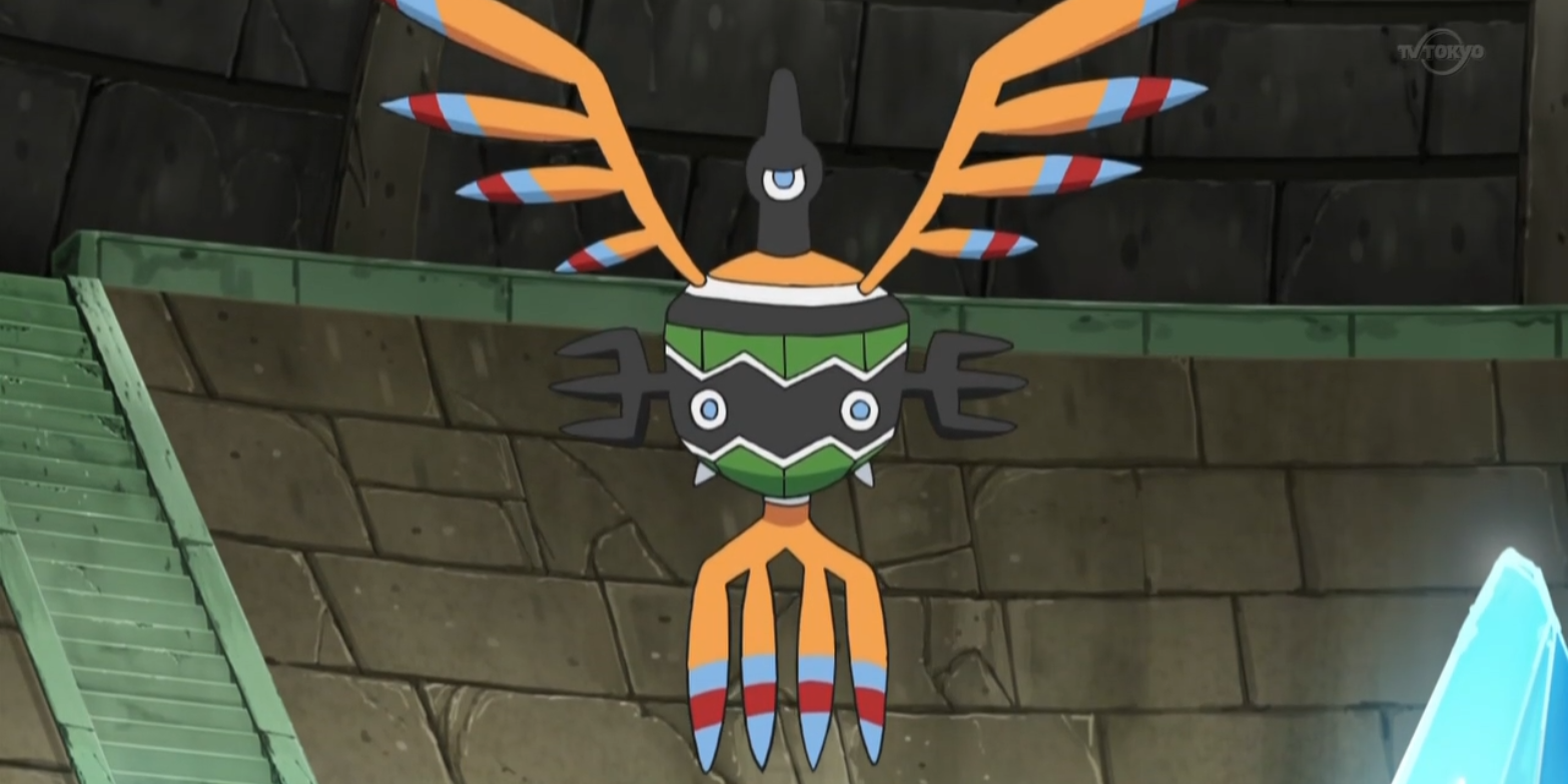
If any generation gets ire for "bad designs", it's Gen 5. Unova's Pokedex was wildly inconsistent. There were some additions that were instant classics, and some that were just head-scratching. The biggest issue in their designs is how overly-designed they are, particularly the legendary Pokemon. However, designs like Sigilyph are also a bit much.
This psychic bird Pokemon is appropriately mystical in design, but there's just so much going on. It's hard to tell the head of Sigilyph from its tailfeathers. With so many clashing colors, it's not even internally consistent. The design can work in theory, but in practice it's just far too bizarre. At the very least, it's surprisingly effective in combat.
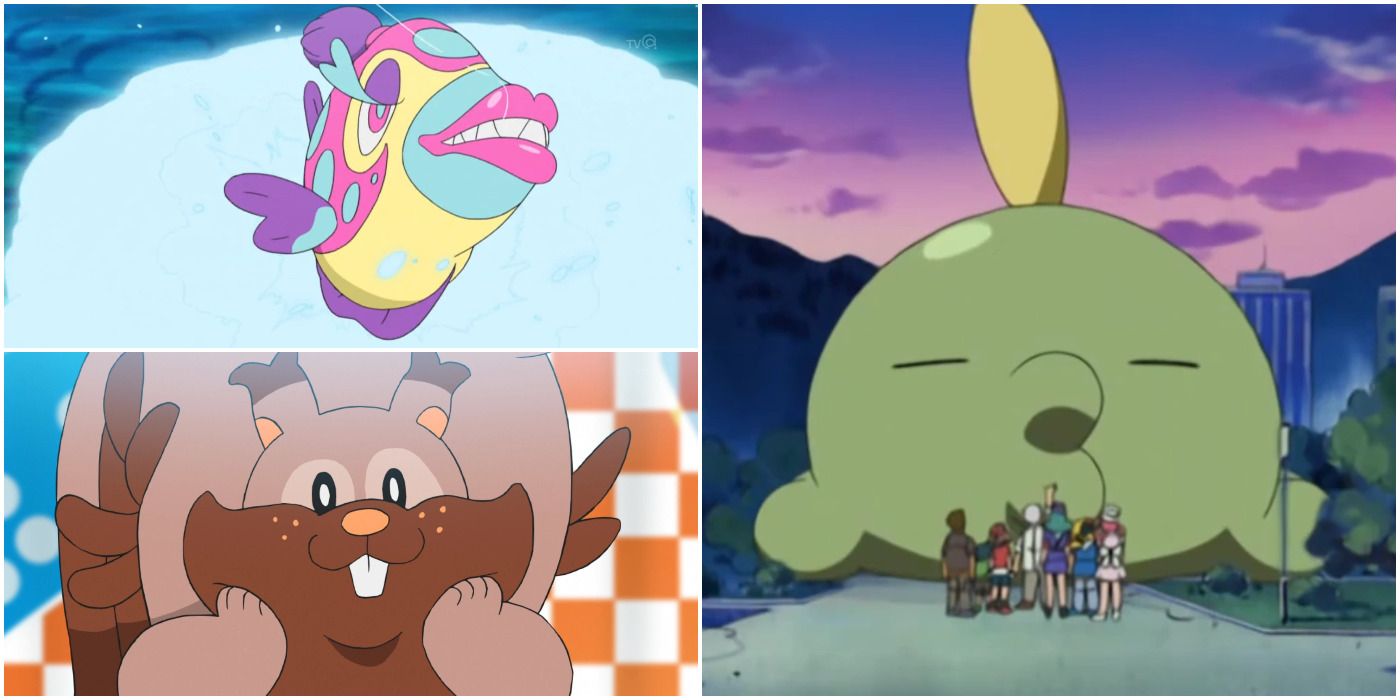
8 Greedent
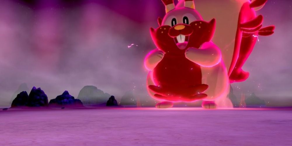
Some people may find this Pokemon more charming than awful, but Greedent absolutely has an uninspired design. This early-game normal-type shares similar attributes to ones that came before it. However, in Sword and Shield, it's appearance isn't one that's fun or exciting. Much like Raticate, it's just annoying to find.
RELATED: Pokemon: 10 Normal-Types That Deserve A Second Typing
However, it's hard to pin down exactly what about Greedent is so off-putting. When you consider a Pokemon like Gumshoes, for instance, that has a design and personality in it. Greedent is just a big squirrel. It's most unique trait is that it eats a lot of food. While relatable, that doesn't exactly make for a unique or interesting design.
7 Lumineon
Speaking of uninspired designs, Lumineon is absolutely one of the most snooze-worthy Pokemon. Finneon gets a pass because, despite being "just a fish", it's rather adorable. Lumineon is still kinda cute, but also absolute just a gosh darn fish. In an ocean of water types, why would any self-respecting trainer pick Lumineon?
Sinnoh has some incredible designs within the region. There's hardly a Pokemon that seems out of place or in the lower ranks of designs. The Burmy line get a special mention, but they serve a purpose and are certainly unique. Lumineon is not that. The worst part: Lumineon isn't even worth using in battle. Other bland water-types have a niche, but Lumineon is just shark bait.
6 Dunsparce
Dunsparce is a Pokemon so awful that it looks around to being loved ironically. It's a creature that looks like it lives in constant agony. It has tiny wings, no arms, no combat prowess, and honestly just looks so sad all the time. Again, while relatable, it's still hard to ignore that Dunsparce's design is just bad.
At the very least, when compared to other Gen 2 designs, Dunsparce stands out. A younger trainer would likely not be able to tell the difference between a Johto and Kanto Pokemon if they were in a line-up. The designs are often so bland, that the outliers stand out more as a result. Dunsparce, unfortuantely, stands out in the wrong direction.
5 Thievul
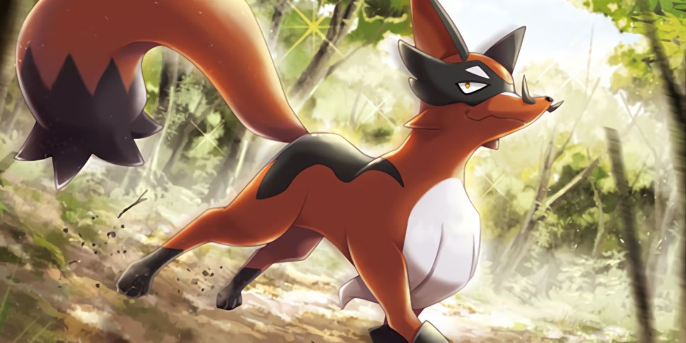
When looking at Galarian designs, Greedent is bland and disappointing. Thievul, another early game Pokemon, ruins any and all potential of a good design. A pure dark-type thieving fox Pokemon seems like a no-brainer. It's something that makes so much sense, it's a wonder it wasn't done sooner. Nickit is pretty adorable, for what it's worth.
Thievul, on the other hand, just doesn't look great. The body of the Pokemon is pretty generic and unimaginative. The mask it wears on its face is a nice touch, and a great place to stop. The mystery is in why they decided to give it a curly mustache. While a staple of the aesthetic they were going for in the mustache twirling villain, it just stands out as odd on a Pokemon that looks so normal otherwise.
4 Gulpin
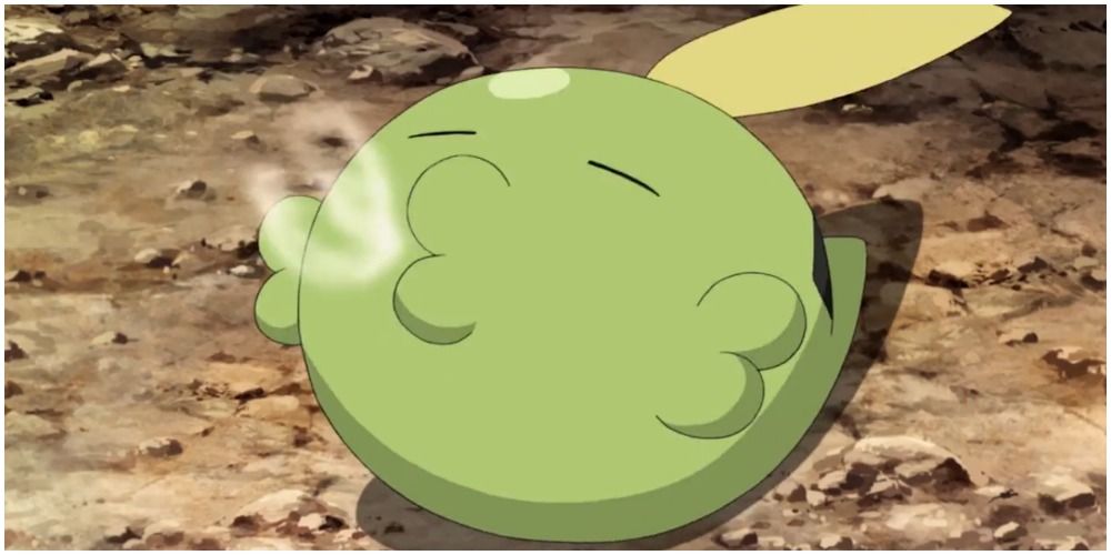
Hoenn designs, similar to Johto designs, often lack creativity. Fortuntately, there are a number of great designs when creativity is flexed. Some are outright bizarre, like Castform, but even Castform can sort of be identified as something that could be real. Something like Gulpin and its evolution, Swalot, are total anomalies.
RELATED: The 10 Best Cat Pokemon Designs, Ranked
What exactly is a Gulpin? Other than the set up for a "deez nuts" joke, Gulpin is literally an amorphous green blob with a feather-like thing on its head. It seemingly doesn't have a basis in the natural world. How does it live? How does it survive? Is it just here to suffer? It's somehow worse than the literal sludge that is Grimer, because at least that's something recognizable. Gulpin is just too abstract to work as a design.
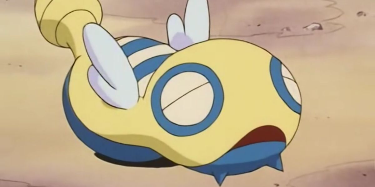
3 Stunfisk
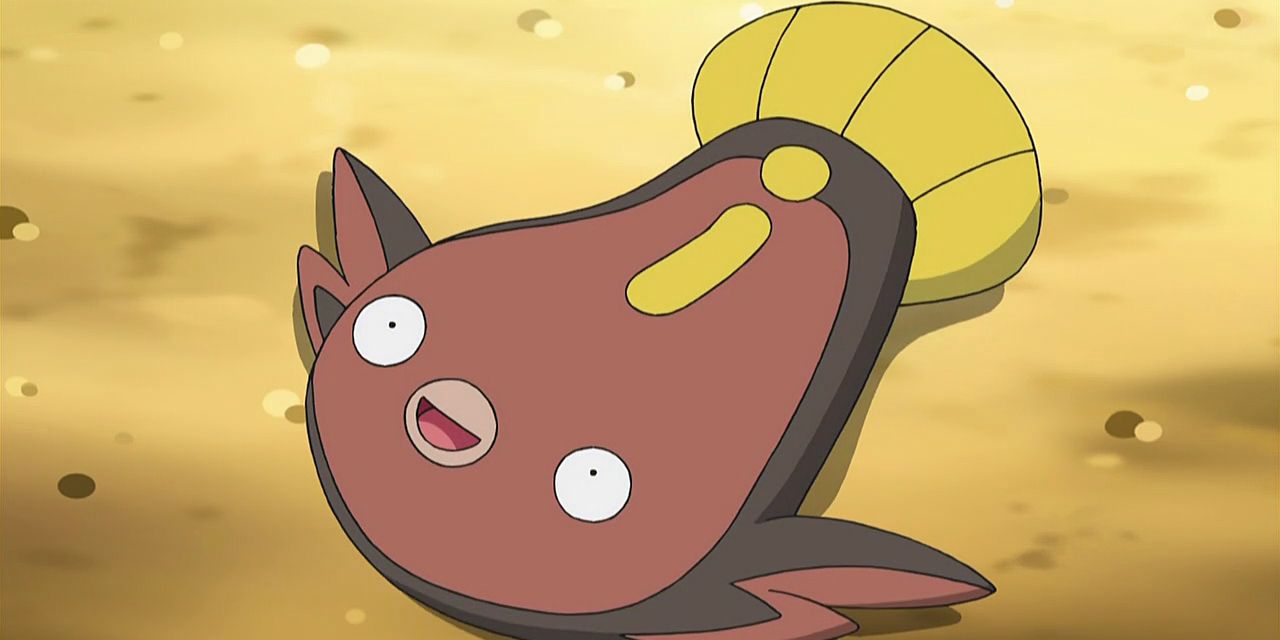
Of course, it wouldn't be a list talking about bad Pokemon designs without one of the most iconic "awful" designs. Yes, Stunfisk is a bad Pokemon design. It's a fish that has been flattened like a pancake, and it lives its life as a shock trap for unsuspecting Pokemon. It has odd typing that makes it stand out, but that's not always a good thing.
Stunfisk is another example of a Pokemon that just looks sad. It's in the same vein as Dunsparce or Gulpin, but just so much worse. Its Galarian design that makes it look like a bear trap is at least an inspired take on the Pokemon. Unovan Stunfisk is a flat, sad fish, and it's no wonder why people don't like it very much.
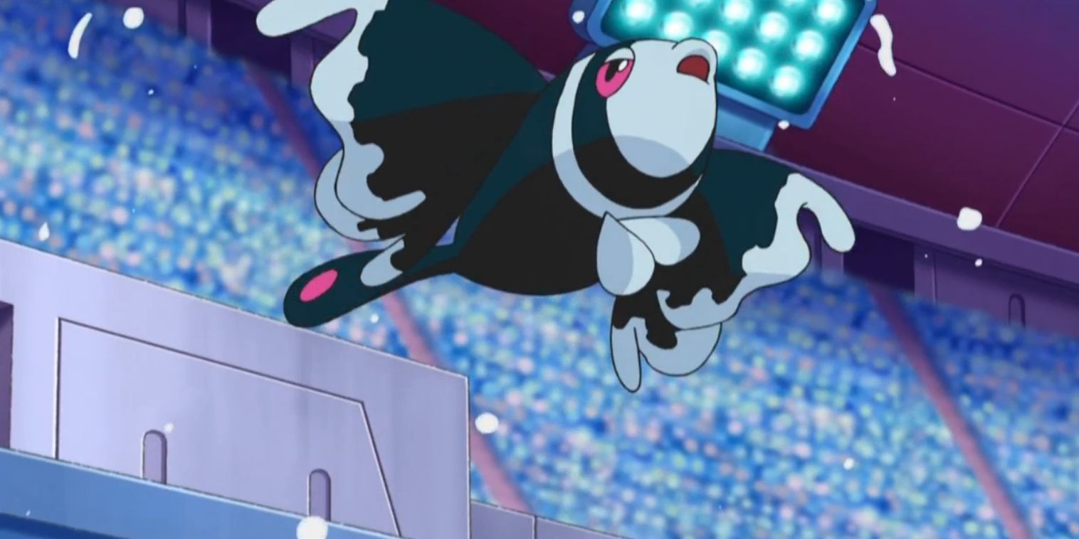
2 Bruxish
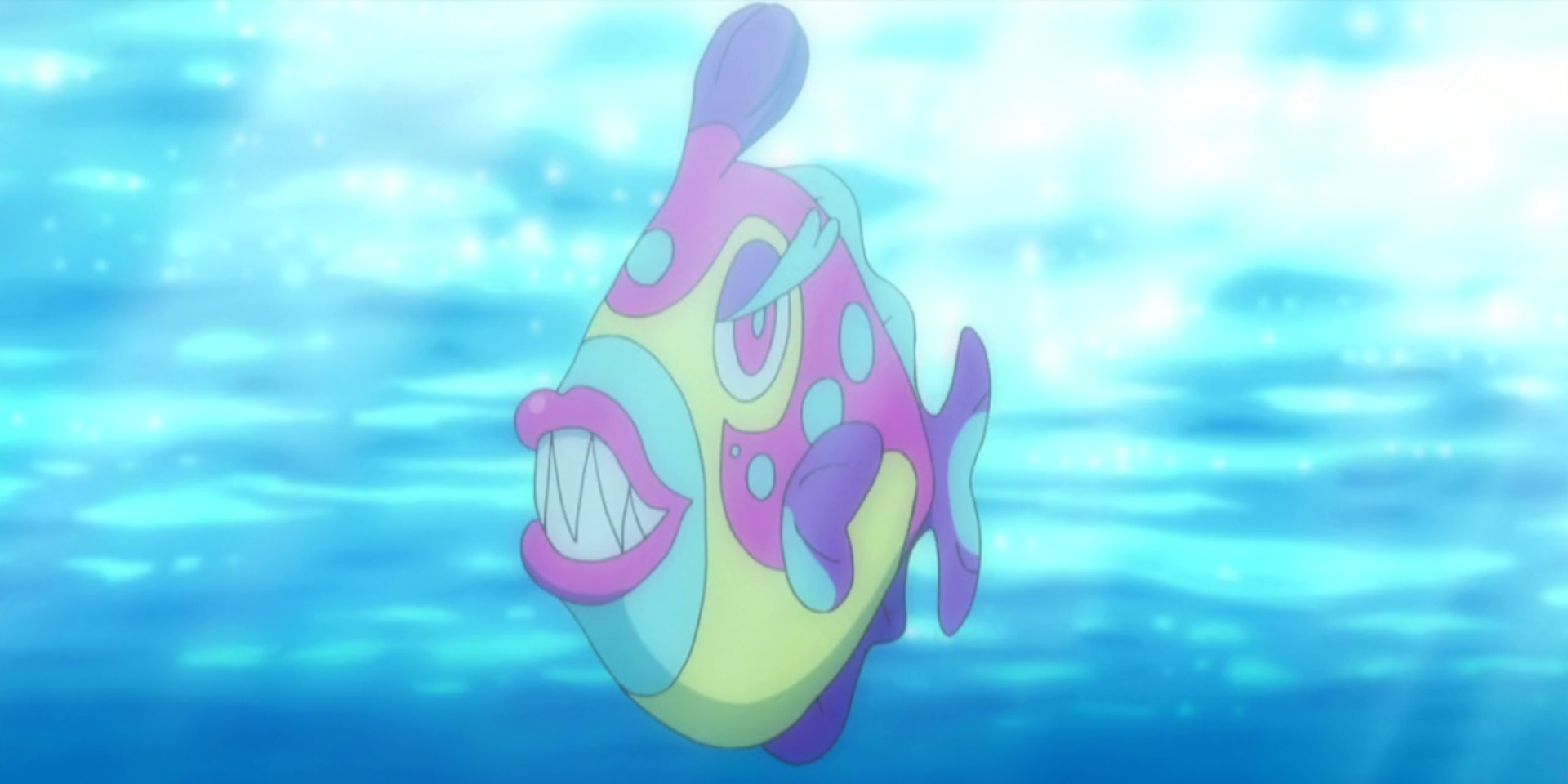
Bruxish is a fascinating Pokemon. In the colorful region of Alola, there are so many odd and exotic designs that even the weirdest ones seem to fit in. Yet, Bruxish is definitely the weirdest and worst of the bunch. This is despite having a legitimately cool ability, movepool, and statline. It has so many great qualities that aren't its design.
Bruxish is another fish, but it looks like a rejected creature from Spore more than a Pokemon. From the odd antenna on its head to the pronounced, human-like lips on its mouth, it makes no sense. It's almost charming in how awful it is, but it's a lot less pitiable than something like Dunsparce. It's genuinely a frightening Pokemon.
1 Aromatisse
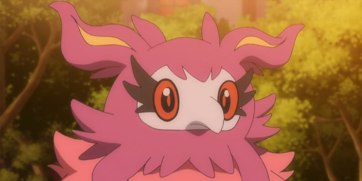
During the lead up to the release of Pokemon X and Y, various designs were revealed to players. This included some new fairy types. Spritzee, was an interesting bird-like design, and many people felt it looked like a plague doctor of sorts. There were some interesting fan-made evolutions for it due to that, playing on its nature as a fairy-type. The final form of it was... a choice.
Aromatisse, the evolved form of Spritzee, seems to abandon anything that made Spritzee a cute or interesting Pokemon. While its design is certainly unique, it's hardly appealing. It has weird twintails, then its body is just something that is hard to really define. It's a cloud of ruffled feathers that, while it does look soft, just doesn't make sense. Aromatisse is the biggest piece of wasted potential in the series.
Next: Every Pokémon Generation Ranked By Their Pokémon Designs