In recent years, Xbox consoles have received various kinds of software updates to the user interface, with some being more well-received than others. Xbox already announced there will be future capture and share feature updates added to the Xbox Series X, but a recent update has caused a stir among some Xbox players.
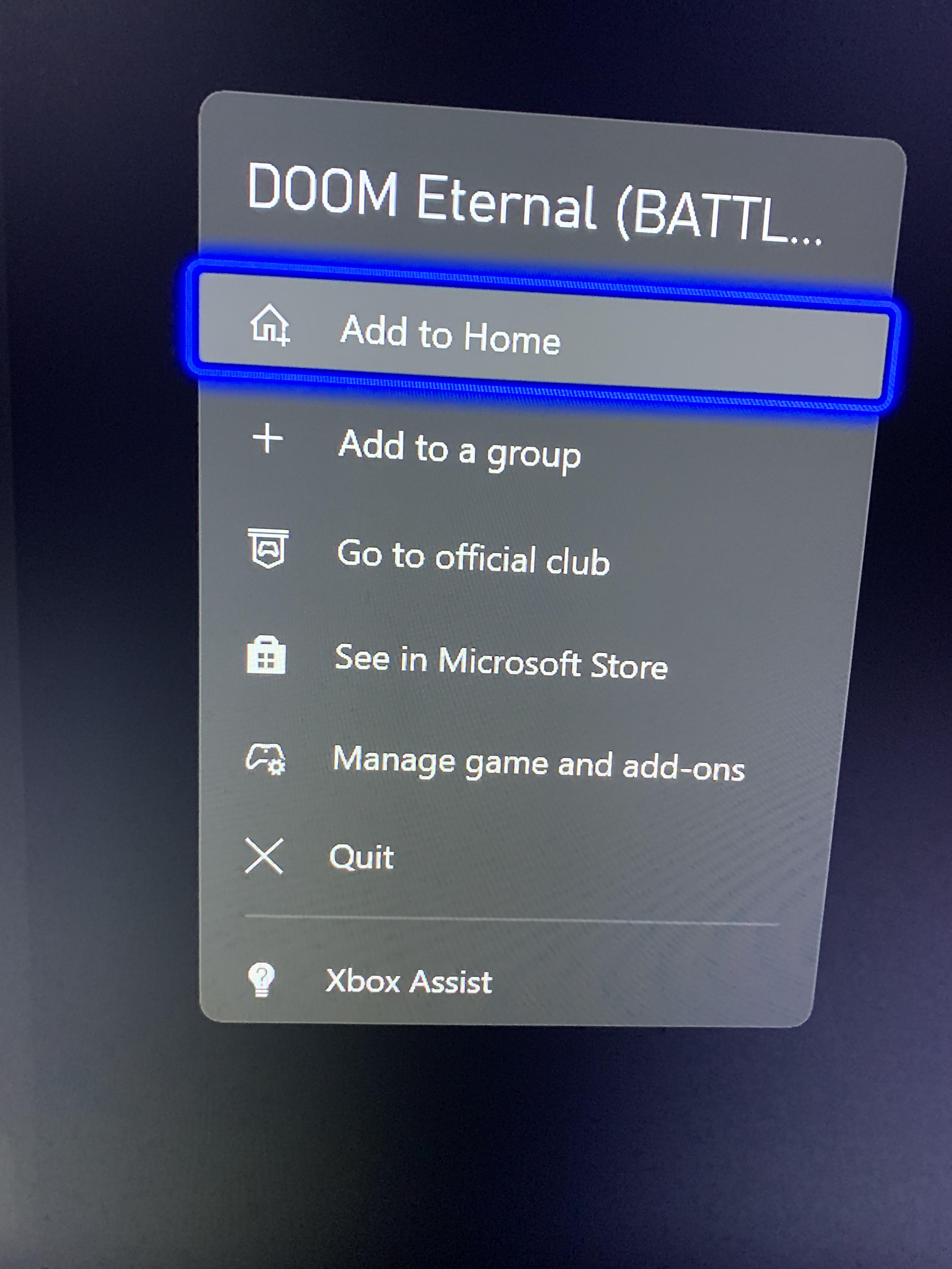
The Xbox Series X team applied a new update to the Xbox UI menu that placed the Xbox Assist option at the bottom of the menu, and thus the Quit option was moved up one spot from the bottom. This change has frustrated some players, who voiced their discomfort with the change online given they were used to where the Quit option was. As such, they tend to accidentally press the Xbox Assist button while trying to quit a game or close an app, perhaps to let a download go quicker.
RELATED: Comparing the PS5 and Xbox Series X UIs
According to Xbox Series X players on Reddit, the issue stems from the fact they are used to having the Quit button at the bottom. Some attribute it to being a sort of muscle memory when it comes to using the Quit button, as it has been there for years now on recent Xbox consoles. To them, the Xbox Assist's placement in the Xbox UI throws things out of whack, as they accidentally end up opening the feature several times.

Plenty of the commenters were irritated by Xbox switching the menu options around. Some questioned why the Xbox team put the Xbox Assist option there, saying it should've been placed higher, perhaps closer to the top of the menu instead of the very bottom. Most just saw the change as unnecessary, and that other options could've been moved to the UI menu instead of the Xbox Assist, which few of them said they used at all.
Some players say they'll get used to the change in time, but say it did throw them for a curve here or there when trying to quit their games and apps. Some even joke about Xbox seeing a quick rise in Xbox Assist use by accident. Plenty of the commenters just want Xbox to put Quit back where it was, and move Xbox Assist in a better position on the menu. Overall, many players are just irritated by Xbox shuffling the menu options on the Xbox UI menu suddenly after they've gotten used to what it looks like for years.
MORE: 10 Things You Didn't Notice In The Xbox Series X UI
Source: Reddit

