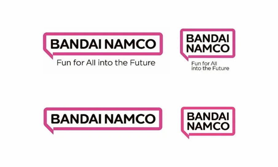
Bandai Namco is one of gaming's most recognizable developers and publishers, working on a large variety of games. In a surprising move, Bandai Namco Entertainment announced it is changing its logo, moving on from its classic orange one.
It has been an exciting year for Bandai Namco, as the company has released multiple game of the year contenders. It started the year off strong with Little Nightmares 2, an excellent (and unnerving) sequel to the original Little Nightmares, expanding the narrative and world that began there. Then at the beginning of summer, Bandai Namco released Scarlet Nexus, an innovative anime-inspired, action RPG, and subsequently brought summer to a fantastic close with Tales of Arise, the latest entry in the massive RPG franchise. Now, with the highly-anticipated Elden Ring on the horizon, it appears that Bandai Namco is making some changes before going much further.
RELATED: Bandai Namco Trademark Suggests Klonoa Could Return
Bandai Namco has released an official press statement detailing its new logo and other company changes. The new logo is very simple, it being the Bandai Namco name in all capital letters, bordered in a clean magenta speech-bubble. Masaru Kawaguchi, President and Representative Director at Bandai Namco, explains that the logo change is a reflection of the company's new "Purpose" statement, "Fun for All into the Future," which replaces its old "Mission and Vision" statement. These changes will go into effect next spring in April 2022, meaning titles like Elden Ring will retain the old orange logo on its branding and art.

The previous logo and "Mission and Vision" statement have been Bandai Namco's identity for many years. Kawaguchi details that the "current logo expresses the fusion of Bandai and Namco that was created when the two companies integrated." Regarding the new logo, they speak directly about the "speech bubble motif," explaining, "[It] expresses the potential of the brand to connect with people around the world and inspire them with amazing ideas." They also add that it makes direct consideration of the worldwide boom in manga culture, which makes sense to integrate into the logo, considering Bandai Namco makes Dragon Ball, One Piece, and many other manga-based video games.
In recent years, there has been a noticeable trend in minimalistic logo design in practically every industry, and Bandai Namco has become a part of it. Many are not happy with the logo change, from how iconic the current one is, to how seemingly boring the new one looks. While the new logo is a big departure from Bandai Namco's current one, as Kawaguchi expresses, it comes with a new change in company direction and has a deep connection to the games its develop. Those who are disappointed with the new logo should remember from the Wii's logo, that it is a long process getting a logo right.
MORE: Tales of Arise Continues Themes Seen in Zestiria, Berseria
Source: Bandai Namco

